- BY Colin Yeo

New Look
THANKS FOR READING
Older content is locked

A great deal of time and effort goes into producing the information on Free Movement, become a member of Free Movement to get unlimited access to all articles, and much, much more
TAKE FREE MOVEMENT FURTHER
By becoming a member of Free Movement, you not only support the hard-work that goes into maintaining the website, but get access to premium features;
- Single login for personal use
- FREE downloads of Free Movement ebooks
- Access to all Free Movement blog content
- Access to all our online training materials
- Access to our busy forums
- Downloadable CPD certificates
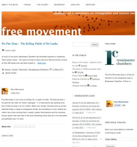
More observant visitors to the blog will notice that there have been a few changes, as trailed a couple of weeks ago. These are mainly visual so far, but the metered access will follow in the next couple of weeks as will some new forum software and changes to blog emails.
Overall, the site should now load more quickly, the fonts are more modern, there is less white space and post types (I mainly use normal and link types) are more clearly differentiated.

Link posts have a picture of a link, a dark header and click through straight to the resource in question, normally BAILII. The post topics (called categories) have more prominence so that it is easier to find other posts on the same subject. The site should work much better on mobile devices and different screen sizes.
There are only two columns now and the immigration case and UK Border Agency (still no new name announced…) updates have been combined. The Twitter feed has less prominence as an increasing number of people seem to be on Twitter now anyway.
At the end of posts there is now an author box with a picture, a bit of information and links to social media and a website for the author. If you have contributed to the blog in the past and want to update these details, log in and navigate to your profile page. Or drop me a line.
The pages are now more clearly marked as drop down where appropriate and they have made their way to a dark bar at the top of the page where they take up less space. I will be pruning these back in the coming days.
The theme is Standard by 8bit. As well as all of the above, my life ought to be easier as the theme has excellent support on which I have already drawn.
SHARE

